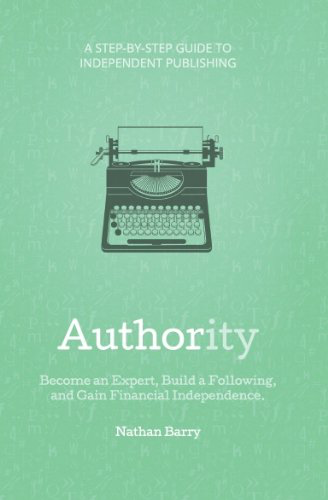
I started reading Authority by Nathan Barry. It’s one of those cheap e-books that’s motivational. But it does get at a point I’ve sucked at: I should teach what I know, and teach what I learn. I’m starting to feel selfish keeping knowledge to myself, as though I’m hoarding it, or when I learn something and don’t share it, or specifically when I don’t reinterpret it through my own lens, that’s when I’m most vulnerable to a kind of guild the educated privileged feel when they encounter someone who doesn’t know that what they do even is something one could do, let alone the specifics of what it is that you do.
I explained skeuomorphism to someone yesterday and got paid to do it. It was fun and easy. I explained it in the context of redesigning a very simple and flat user interface for an educational iPad app. They wanted to have better icons for students who were just starting to read. That makes sense: students might not be able to read what the “Erase” button says. But I had to caution him against his instinct of making it “look like an eraser.” Which eraser, from where, and how do we make that look like an eraser while keeping the rest of the theme consistent. I explained the difference between an iconic representation of something and a realistic representation because they were going to talk to an artist to commission some icons, and I wanted to make sure my app design wasn’t compromised, which tries so hard to be faithful to the physical thing that inspired it.
I could very easily turn around and write a blog post about that. Just to share that little bit of story. Or go deeper, explaining that iconic things ultimately try to evoke affordances, to show what a thing is for, while realistic things focus more on trying to convey the metaphor. Imagine we want an icon to replace a button that says “Erase.” Our choices are between a realistic depiction of a pink gum eraser or a trapezoid with a line underneath it to one side. The former is obvious; we’ve seen erasers before and used them. Their affordances are pretty transparent. As long as I know what to do with an eraser like that, it’s easy to infer what the button does. The trapezoid with a line underneath it, meant to convey the standard gum eraser and its action, mainly dragging across a page to erase, relies on one large hurdle: the user has to infer what the trapezoid is.
If the design is well-done, proportions just so, then maybe it’ll succeed. But children are not the best at focusing in on a single interpretation of an iconic design; this is why our children’s applications tend to have a lot of detail, shading, color, sound, and responsive interactions. I don’t think any of this is necessary. (I see a lot of this as trickery to entice children to stay in your application, a kind of frosting and sprinkles, or as is parroted without much critical thought, “chocolate-covered broccoli.” Make an apple or a carrot. Still sweet, fun to eat with nothing but your hands, more sustainable, and better for those who want to eat more.) To succeed with a minimal design in technology for children indicates good design.
Or not. When I was a kid, in our (Montessori) school we had about fifteen computers scattered about our classroom, for a class of 30 kids between 4th and 6th grade. Many of the tasks we were assigned to do every quarter involved progressing through a series of problems about grammar or arithmetic administered through computer programs written by the head teacher (in QBasic, the language we were all taught to program in). The computers ran DOS on old monitors; they were donations, mostly from professors and business people who upgraded their homes or offices or labs. The school was a non-profit so their donations could be written off on their taxes. The programs were simple things, white text on a black field with color here and there, used to represent and connect to other parts of the curriculum. (I still think about these colors and shapes when I think of the parts of speech; the point of the task, which starts in 2nd grade with big metal manipulatives, is to develop a kind of synesthesia when thinking about a sentence and its constituent parts.) They were simple. But they were engaging enough that we played them on our own time, which at a Montessori school is most of the time. We never dreaded them, and only complained about them in the same way that workers in an office complain about any work they’re expected to do. They were enough. And they’d hold up now, though a four-year-old with an iPad is afforded far more complicated, nuanced, and potentially better learning design and spaces than what we were given with a 5lbs steel keyboard in front of a CGA screen atop an 8086.
Anyway. I wrote about something I know about. It felt good. You should do it too.
